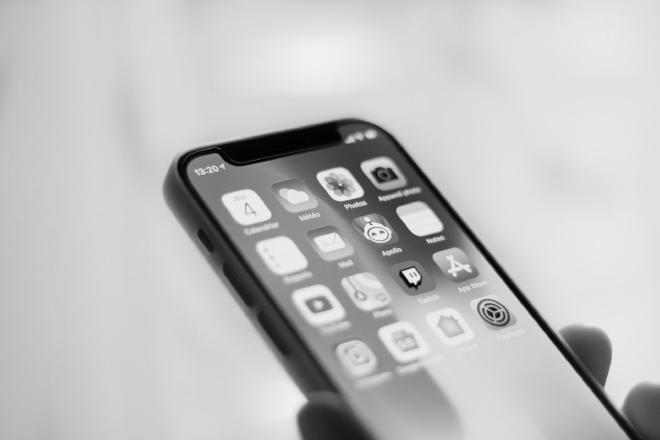
Like everyone else, I spend way too much time on my phone and tablet. A large part of it is because I love feeling informed (something I even built an app to tackle). And yet, there is another aspect that goes on a far more fundamental level - these devices are actively being designed for attention.
Visuals play a crucial role here. There have been studies on the use of colors going back for decades. The research boils down to two things:
specific colors mean different things. For instance, green is for success, blue is for information, red is for alerts, etc.
flashy and exotic colors trigger the creation of hormones in the brain. This is frequently used in games or social media apps to reinforce the user positively. As a result, people often get drawn back to the app, craving for that extra bit of dopamine. Far too often.
Remove all the attention, and your phone suddenly stops being so attractive. That’s at least what I want to prove.
Luckily most devices nowadays provide a way to turn one’s screen into grayscale. It is usually neatly tucked somewhere deep into the Accessibility Settings, but you will quickly find it with a bit of googling. On iOS and iPadOS, for example, it goes like this:
- Settings
- Accessibility
- Display & Text Size
- Color Filters
- Switch Color Filters on and select Grayscale.
I will be happy to report in 30 days, whether it has worked or not. In addition, I’d like to check two other things:
- The effect of grayscale on my eyes (I suppose it will be beneficial)
- The impact of grayscale on the battery ( I guess it will stay the same, at least)
Has anyone else tried this technique? Feel free to share your experience in the comments below 👇
Have something to say? Join the discussion below 👇
Want to explore instead? Fly with the time capsule 🛸
You may also find these interesting
Is Swift Playgrounds the Future of Apple App Development?
Is this the beginning of the end of Xcode?
 Preslav Rachev